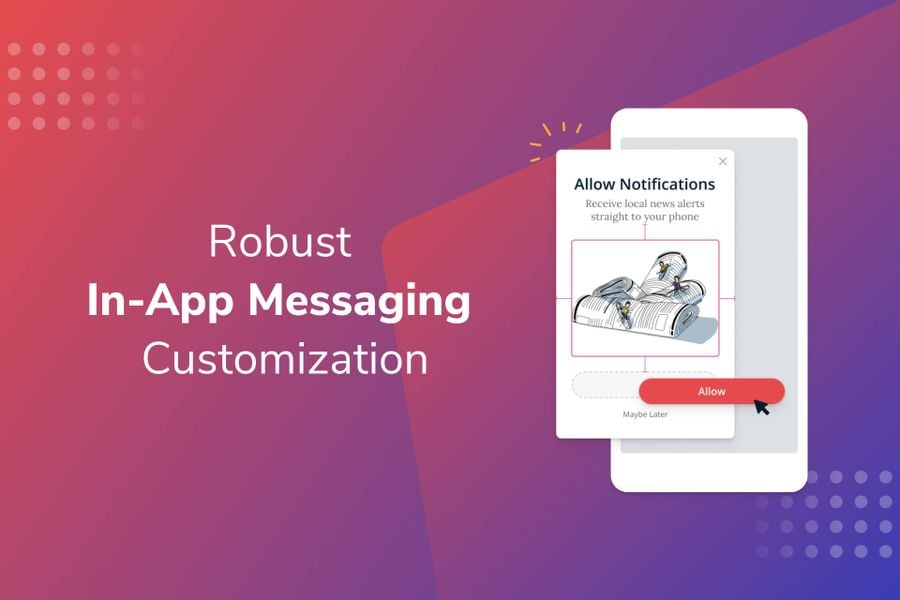
With our industry-leading in-app messaging product, you can reach all your active users — even those who haven’t opted in to push notifications. These messages are crucial in enabling companies to set up clear user onboarding, gain push opt-in, enhance the in-app experience with important announcements, and drive revenue with promos and offers.
In-app messages provide an extra layer of interaction with users while they’re actively engaged. Since these messages appear within your app, they are an extension of your app and your brand. We’ve recently added more in-app customization options, giving you even more control in aligning your messaging with your brand, all with no code or app releases required.

Message Customization Options
Colors
We’ve expanded our visual formatting options to include RGBA color values. These are similar to hex codes, with an additional alpha variable for transparency. You can now adjust the transparency to make your fonts and buttons blend more into your background.
Fonts
Your text copy communicates your message. Choose from among the top 20 Google fonts to customize your brand. Access additional color, formatting, alignment, and margin options. Make your text, bold, underlined, or italicized to emphasize a specific part of your message.

Images
Images immediately draw attention to your message. Now, you can quickly adjust the margins directly from the dashboard. This saves you time in creating your messages, and you don’t have to worry about uploading only appropriately-sized images.
Button Blocks
Buttons are a big driver of engagement. You can use these to deep link to a specific part of your app or seamlessly poll your users. We’ve also made changes to give you more control over your buttons’ font, color, formatting, edges, border, drop shadow, and margins. Optimize your buttons to encourage action when you have an important announcement or want to drive engagement with a promotion.

Close Button
The close icon allows your users to dismiss your in-app message. Now, you can easily toggle it on and off. Removing the close icon guides your users to take the desired action in your in-app message, such as clicking a button. For Carousels, you can place the close icon on any card - by placing it on the last card, you can make sure your users progress and see each screen.
You can also adjust the width, height, and margins, as well as include additional click actions beyond just dismissing the message. For companies that want even greater customization, you can even upload your own custom close icon.
Start Customizing Your In-App Messages
Visit your dashboard to access these new customization options and create a cohesive mobile experience for your users. Changes to your messages are automatically reflected in the message preview as you edit the content, so you can be confident in what it will look like for your end users.
These new customizations are available for all in-app messages, including our in-app Carousel, which features up to 10 screens of content. Your existing in-app messages have automatically been updated with the new functionality as well. Customize and personalize your in-app messages today to improve app engagement and retention, reduce churn, and drive revenue.
Get Some In-App Messaging Inspiration
Need some ideas to jumpstart your messaging strategy? See how other companies have used in-app messages to enhance their app experience and meet their goals.
Read: 6 In-App Message Examples from Successful Apps


