We've made some exciting improvements to our in-app messaging product. Read on to find out what's new.
Greater Control Over the Fullscreen Experience
The background can set the mood for your entire in-app message (IAM). Now, you can adjust your message background’s width, height, visibility, and margins to better tie it in with your app experience.
Easily toggle between with or without margins to control the size of your in-app message. Without margins ensures your IAM takes over the full screen without any margins. You can also adjust the transparency so that your app shows through the background.

No need to worry about how your message will render across your end users’ devices. We support notch detection for most devices and will automatically resize the IAM for the best user experience. Full screen without margins will render for devices on iOS 3.9.0 and Android 4.6.3 SDKs and later.
Ready to upgrade your IAM experience? Access tips for designing your in-app messages.
Preview Landscape IAMs Before You Send
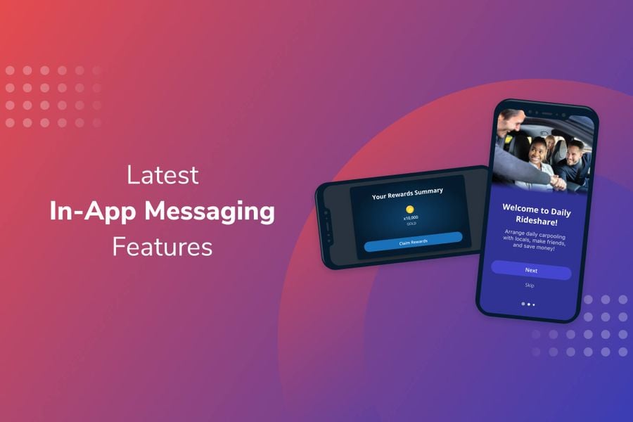
Some apps, such as certain games, predominantly operate in landscape orientation. With this in mind, we’ve now made it possible to preview your in-app messages in landscape mode. Easily toggle between portrait and landscape to see how your messages will render. This added functionality offers peace of mind that your IAMs show as intended and helps streamline design decisions.

Easily Export Your Data to Optimize Reporting
Understanding what does and doesn’t work with your audience is core to optimizing your messaging strategy. Now you can easily export your IAM data to break down and analyze how different messaging elements perform.
Available Data
Access the following data through the dashboard export as well as the API:
- Impressions - number of times the message is shown to a user
- Clicks - number of unique users who have clicked on a button element or on the background
- CTR - click-through rate
You can use this to compare performance across your in-app messages or historically within a single IAM. Perhaps you discover that one particular CTA outperforms in your onboarding sequence. Maybe you realize that the new image you’re using in a given message is performing worse than the previous image. Analyzing your data and acting on insights can help you drive more conversions.
More Inspiration to Elevate Your IAM Strategy

Shake Shack uses in-app messaging to promote regional menu items and events, announce new app features, personalize its customer experience, and much more. Read the case study to find out how they used IAM and other channels to achieve unprecedented growth amidst a challenging global pandemic.
Read the Shake Shack Case Study


