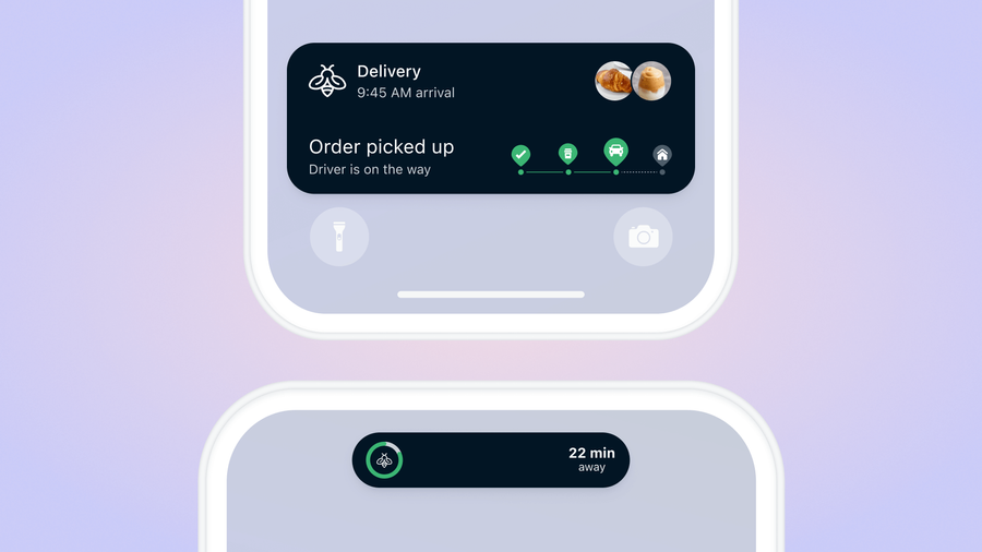
If you want to start boosting mobile user engagement, your #1 key to success is finding ways to escalate relevant information to your users’ home screens. Apple’s iOS Live Activities takes the timely, urgent nature of mobile push notifications to the next level, by presenting a persistent, real-time status bar across the home or lock screen.
The result is a contextually relevant display delivering the most critical information users care about and can digest at a glance. If you have ever waited for an Uber or passively checked in on sports scores for a game in progress, chances are you have enjoyed the seamless nature of Live Activities.
Do Live Activities actually help improve user engagement?
Absolutely. Our State of Customer Engagement Report found that apps using iOS Live Activities have 23.7% higher average 30-day retention rates.
But Live Activities aren’t reserved for ride-sharing, sports updates, or food delivery services only. There are dozens of unique use cases to take advantage of this engagement-friendly channel — to do so effectively, let’s run through some Live Activities best practices to maximize your user engagement rates.
iOS Live Activities Best Practices: User Experience
1. Clearly Defined Start/End
The most foundational Live Activities best practice requires that you clearly understand the purpose of these real-time status notifications. Live Activities should only be used for events or tasks with a defined beginning and end.
Most commonly these use cases include:
- Delivery updates
- Rideshare statuses
- Sports or event broadcasting
- Fitness leaderboards
- Mobile game live events or challenges
- Travel tracking
- FinTech or Crypto tracking
- Multi-purpose countdowns
The duration of your Live Activities should coincide with the end of the related event, promptly ending when they are no longer relevant. Additionally, a single Live Activity should last no longer than eight hours and should disappear from user home screens within 15-30 minutes of the event’s end.
2. This is Not Ad Real Estate
Live Activities should always provide value to your users. This is not the place to display ads or dedicated promotional content. Users are already accustomed to receiving only critical information through Live Activities, meaning any generalized promotions are going to stick out like a sore, spammy thumb and most likely lead to users turning off your Live Activities.
If you do insist on including relevant promotional material, ensure that it is intrinsically tied to a live event or task. If you are looking for ways to increase engagement through Live Activities, consider adding gamification elements to display reward progress, deliver breadcrumbed value, and increase the overall user experience.
3. Deep Linking
To create a seamless user experience, your Live Activities should not only direct users straight into your app but also contain deep links to send users directly to relevant locations within your app. Don’t force people to do extra navigating — your Live Activities are displaying specific information and your users expect an instant path to learn more should they tap on it.
Our guide on deep linking best practices can help get you started with these incredibly useful app additions.
4. Know When To Use Push And When To Use Live Activities
Although both notifications deliver critical information to user home screens at opportune times, Live Activities and push notifications actually have distinctly different use cases.
Push notifications are perfect for sending one-off messages over time. This may look like a series of reminder notifications sent to new users who have downloaded your app in the last 24 hours to bring them back to the onboarding process. They may play a part in your social engagement strategy, helping users stay aware of when someone sends them a message through your app or they may take the form of personalized promotions and offers.
Live Activities are for persistent, real-time event tracking. You can rely on your push notifications to drive users to your app to find important information, but your Live Activities should be the channel being used to track all subsequent live updates through Live Activity alerts. Do not use push notifications to alert users about Live Activity updates.
While the occasional Live Activity alert is helpful, make sure they remain helpful and are sent sparingly. You’ll want to avoid over-messaging your users and giving them a frustrating reason to unsubscribe from your Live Activities altogether (not to mention too many alerts become a drain on battery life over time!)
5. Use Discretion
Do not display sensitive information in your Live Activities! Put yourself in the shoes of your busy users sitting on a crowded subway, sharing a table at work, or standing in line at a coffee shop. Rather than putting these users at risk of accidentally disclosing personal medical details, credit card information, or private account instructions, dedicate separate alerts to call attention to the private information in question without displaying it.
6. You Only Get One First Impression
Fun fact: when new users receive their first Live Activity from you, they are prompted to “allow” or “not allow” all future Live Activities. Therefore, it is critical that your first Live Activity be free from errors and provide explicit value to users experimenting with your notifications for the first time!
iOS Live Activities Best Practices: Content & Design
1. Design Sensibly
To maximize the effectiveness of your Live Activities, they must meet certain display criteria.
Live Activities will automatically adjust to different screen sizes depending on users’ devices. As you create your notification assets and templates, make sure you are testing on multiple screen sizes to ensure proper readability for all users. Take a look at Apple’s device-specific size values to design your layouts accordingly.
You also want to create Live Activities that are painless to view at a glance. This means using high-contrast background colors to ensure legible text. If your brand uses any bold or unique colors, consider incorporating them into the color scheme of your Live Activities to both grab attention and reinforce your visual identity. Regardless of your design choices, remember to always prioritize the legibility of key information to make your notifications easy to understand. Readability always comes first!
Finally always remember to respect the margins. Live Activity margins should be even and fit to rounded shapes for the best fit. If you are using a rounded rectangle behind your Live Activity text, use a SwiftUI container to help match the shape’s corners to the outer radius of the Live Activity.
2. Consider Every Live Activity Presentation
Live Activities are displayed in three primary presentation types: Compact, Minimal, and Expanded. Let’s look at a few best practices to keep in mind for each.
Compact:
- The compact presentation only allows for small spaces on the left and right sides of the phone camera, so make sure to present only the most important Live Activity information to take advantage of this limited space.
- Use consistent colors and typography to maintain visibility.
- Avoid the urge to add padding between your content and the camera, which creates a misaligned appearance.
Minimal:
- This presentation is used when more than one Live Activity is active at a time, meaning your Live Activity content must be recognizable, even when detached from the dynamic island in a small circle or oval.
- Instead of your brand logo, display the most updated information available, even if abbreviated. If your Live Activity is a countdown, display the running clock here rather than using a static image.
- Always make sure you are linking to the relevant location within your app. Even in the minimal detached presentation, users will tap your Live Activity to be taken to the event-specific page in your app or touch and hold to use other essential controls.
Expanded:
- When a user touches and holds your Live Activity in the compact or minimal presentations it switches to an expanded view, so make sure your content expands predictably without rearranging content too dramatically and forcing people to reorient themselves.
- If your content requires additional vertical space, opt for a height that maintains continuous curves on the sides to maintain the “capsule” shape synonymous with Live Activities. Avoid awkward, “in-between” heights.
- Similar to the compact presentation, avoid spacing your Live Activity content below the camera. Content should always be nested tightly around the camera to maintain space efficiency.
3. Design for Both Light and Dark mode
Your Live Activities should grab user attention, accurately reflect your brand, and offer sufficient contrast in Light Mode and Dark Mode. Apple’s system, by default, assigns a light color background for Light Mode and a dark colored background for Dark Mode respectively. When applying a custom-colored background, verify that it’s lightened or darkened accordingly for both modes or consider using different colors altogether for each mode.
Additionally, since Apple’s system automatically adapts colors in Always On Mode, we suggest double-checking your design on an Always On display with reduced luminance.
In Dark Mode, a key line will automatically appear to help separate and distinguish the Live Activity from surrounding content. Remember to change the color of this key line to remain consistent with the design of your Live Activity and the color scheme of your brand.
Making the Most of Live Activities With OneSignal
As Live Activities become more widely adopted by mobile apps, the opportunities to engage your users only continue to multiply (especially with the addition of new push-to-start Live Activities). OneSignal allows you to design custom Live Activities to engage users in the most highly visible screen real estate available.
Instead of spending months developing Live Activity functionality from scratch, our pre-built tools allow you to get started on iOS devices in a matter of hours (and we’re always updating our platform to stay ahead of industry releases!) View our Live Activities Walkthrough to learn more or try OneSignal for free to get started.
Get Started for Free


