Few things in the world of tech are as ubiquitous as Apple’s family of mobile devices. The iPhone accounts for nearly 60% market share in the US, with iOS products as a whole trending above 60%. If you’re not utilizing iOS best practices, your brand messaging runs the risk of not displaying properly, instantly losing engagement for well over half your audience.
These best practices for Apple push notifications are in place to ensure both the content and design of your push notifications are contributing to your retention rate and not sending users running for the digital hills.
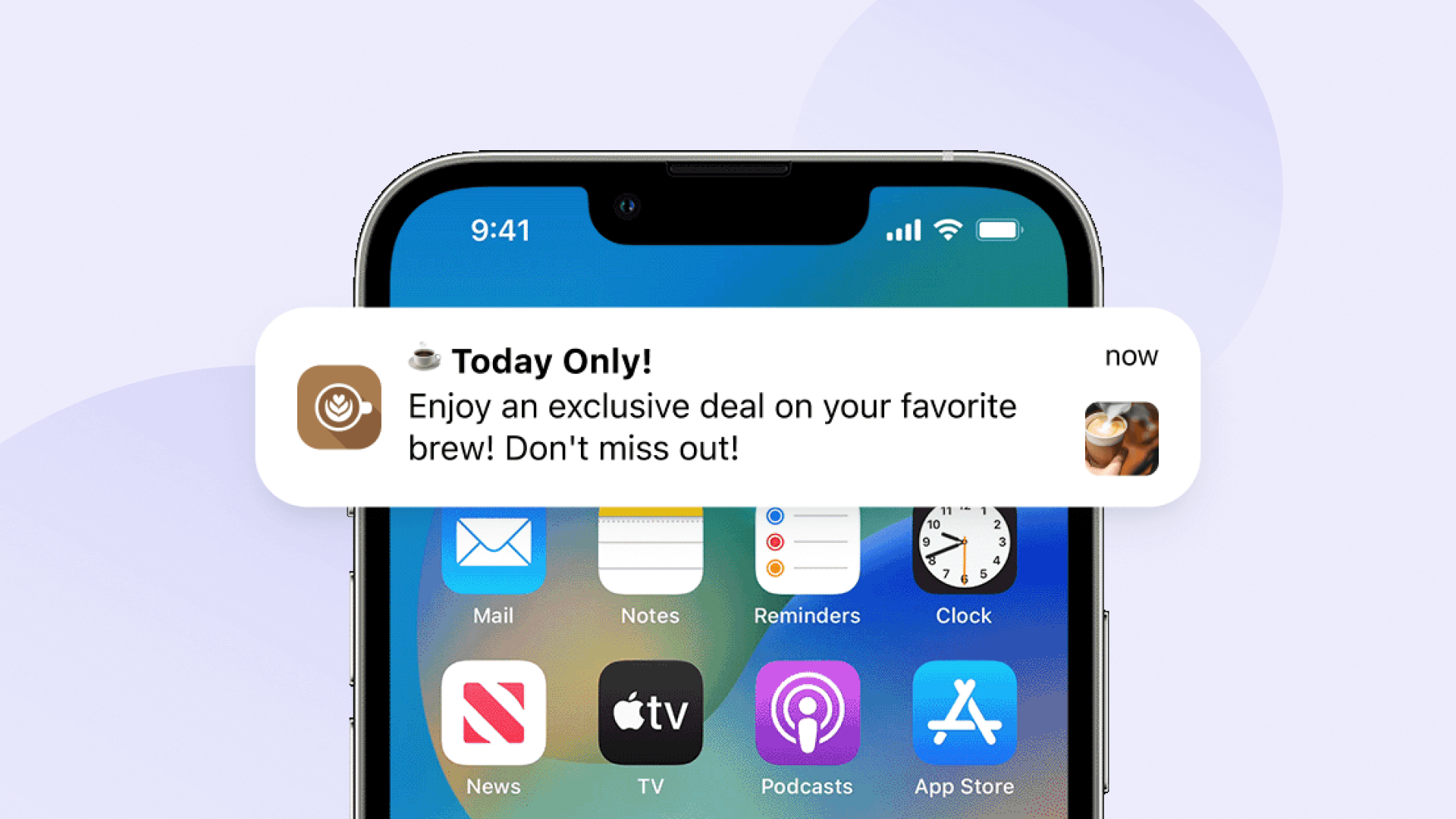
The Anatomy of an Apple Push Notification
The elements of Apple push notifications work together to engage mobile users by grabbing their attention, delivering concise and relevant information, and prompting immediate action. By harmonizing these elements, your push notifications can effectively captivate users' interest and drive virtually any desired interaction within your app.

1. App icon. This cannot be modified on a per-message basis and should embody a recognizable design to ensure contrast and legibility against various backgrounds. Maintaining consistency with your app's branding and color scheme helps users quickly identify your app icon when it appears in push notifications or on their device's home screen.
2. Notification title. Space is limited, especially if your push notifications are appearing on Apple Watches, so keep your title brief and specific — preferably 25-50 characters to avoid truncation. If your title is too long or you must use a generic title for certain notifications, it is often better to simply let Apple’s system display your app name in its place.
Notification headers between 10-20 characters have the highest engagement rate for both mobile and web push notifications.
3. Notification time. Your push notifications will display how old the alert is, updated depending on how long users leave them unread.
Avoid sending notifications during peak downtimes when users are typically busy or inactive, such as late at night or early in the morning. You’ll also want to ensure that notifications are scheduled based on the recipient's local time zone to avoid sending them at inconvenient times. For the most optimal send times, analyze data on user engagement patterns to identify the most impactful times for sending notifications or use our AI Intelligent Delivery feature.
Suppose you have a fitness app that offers personalized workout plans. After analyzing user data, you find that a significant portion of your users typically engage with the app in the evening hours, between 6:00 PM and 8:00 PM. Based on this insight, you decide to schedule a push notification reminding users to complete their daily workout at 5:45 PM.
4. Notification Content. Your notification content should be written in complete sentences with proper punctuation and brief! Technically, Apple won’t truncate your push content until you go over 178 characters, but we suggest keeping it around 120-150 characters to remain readable in both collapsed and expanded views.
As for your push notification action buttons: Your goal is to save people time, without requiring them to open your app and hunt for their destination. Your CTA button should be written in title case and clearly define where it’s sending users.
Best Practices for Sending Apple Push Notifications
Push notifications are a valuable tool for mobile app developers and marketers to engage with users while driving increased subscribers and click-through rates. However, their effectiveness hinges on careful application and adherence to high-level best practices for iOS devices.
1. Be Quick, Be Helpful
Your push notifications should be short and sweet. This is not the place to deliver lengthy feature descriptions or a complex transaction process. Leave that to your email marketing strategy — push notifications are for quick, at-a-glance updates that provide value in a timely manner.
Notifications with less than 100 total characters are 11 times more likely to be clicked on than messages with greater than 300 characters!
2. Localize For Increased Engagement
If you’re fortunate enough for your mobile app to have global reach, obviously not all of your users will speak your language. Instead of crafting a universal marketing campaign in a single language for all countries, a more impactful approach would involve developing multiple push campaigns dedicated to specific locales. This may require additional time, but localizing push notifications is likely to yield increased engagement, sales, and stronger brand trust. To make things easier, OneSignal can automatically identify and set your users’ language based on existing device settings!
Notifications using localization have a 160% higher engagement rate than notifications that don't. Users are also much more likely to make purchase decisions based on notifications in their native language.
Don’t let anything get lost in translation!
Don’t know where to start with localizing push notifications. OneSignal gives you an easy way to send a single push notification in multiple supported languages, all from the dashboard.
3. Avoid Overzealous Alerts
Remember, just because you send a push notification does not mean all users will read it instantly. Avoid sending multiple notifications, especially if they are regarding the same thing, too close together. Yes, users who have subscribed to your mobile alerts want to hear from you, but not at every waking moment. There are a couple of ways you can avoid over-messaging with push notifications.
Rather than sending a single push notification blast to all users, create audience Segments with custom Data Tags and split your user base by interest or past behavior to ensure the information you’re sending is relevant.
Notifications that use personalized content have a 344% higher engagement rate than notifications that don't.
You may also leverage advanced push sending features such as Frequency Capping, which allows you to set a delivery maximum for your users to guarantee that they only receive a specified amount of notifications every day.
Consider notification grouping or notification collapsing to nest multiple push sends under a single notification, eliminating the need to monopolize screen real estate on user devices for alerts relevant to the same topic, such as multiple price notifications or travel updates.
4. Be Direct But Not Overly Specific
While it’s common to inform users about specific features or provide singular promotions via push, but resist the urge to give people overly specific instructions. Users won’t be able to refer back to these instructions after they dismiss your notification, so keep things high-level and let your contextual, in-app messages do the heavy lifting for tutorials or walkthroughs.
Read more about Apple’s Notification Actions which allow you to give users additional actions beyond those of traditional push notifications.
5. Be Mindful of What’s Already on Screen
If your app is already open, your notifications won’t appear. Rather than sending users distracting and redundant push notifications when they are already inside your app, consider in-app dropdowns or the progressive addition of new information in real-time across the user interface.
For instance, in a social media app, if new notifications are received while users are browsing their feed, the app could subtly update the notification icon or display a brief notification banner at the top, ensuring users stay informed without interrupting their browsing experience.
6. Be Mindful of Where Your Users May Be
Use discretion when sending sensitive information to your users — they may be alone in the bathroom or sitting on a crowded bus. Rather than rolling the dice on broadcasting personal information to nosey onlookers, it’s best practice to avoid sending secure information at all.
Instead, craft your push notifications to alert users to the presence of sensitive information without disclosing any details directly. This approach respects the user's privacy and security while prompting them to take action within your app to access the relevant information.
Your push notification content may take a variety of forms, depending on your app:
- Financial Alerts: "Important update regarding your recent transactions! Check your account for details."
- Healthcare Reminders: "Time for your upcoming appointment! Open for more information."
- Security Alerts: "Urgent notification about your account settings! Tap for details."
- Legal Notices: "An important update requires your attention! Please review for further instructions."
- Personal Messaging: "You have a private message waiting for you! Head to your inbox to view."
7. Badge Carefully
Push badges are represented by the small, circular number that appears over an app icon to signify unread notifications or messages. While incredibly practical for users, keep the following best practices in mind to avoid muddling the user experience:
- Don’t exclusively rely on badges to convey notification information, as users can turn them off.
- Keep your badges up to date, so they disappear as soon as users follow up on a notification.
- Make sure your app icon doesn’t contain any design elements that users may mistake for an unread notification badge.
Frequently Asked Questions About Apple Push Notifications
What Are “Destructive” Actions?
“Destructive” actions are notification interactions that permanently remove data, close an account, or make otherwise irreversible changes to users’ experience with your app. Push notifications are much better suited for non-destructive actions as space is extremely limited and their at-a-glance nature comes with the risk of impulsive dismissal or accidental action. However, if you do include destructive actions in your push alerts, they should come with a message that gives proper context to avoid permanent mistakes.
Use the following to notify Apple’s OS to automatically assign special highlighting to your destructive push actions, indicating special attention:
static var destructive: UNNotificationActionOptions { get }How Does Double Tapping Affect My Push Notifications?
Certain Apple devices support a double-tap quick response for mobile push notifications. When a user double-taps your notification, the system automatically defers to the first non-destructive action available. That being said, when you’re selecting your response actions for push notifications, prioritize the most commonly used actions at the top of your list.
For instance, a task management app offering options for task completion could prioritize 'Mark as Done' as the first action, followed by 'Postpone' and 'Edit Details'."
What Do I Do For Recipients Who Have Turned Notification Previews Off?
As you are giving careful consideration to the way you write your push preview text (the short snippet of text that is displayed on the user's device when a notification arrives), you should also be aware that users can (and often will) disable notification previews for their apps. When you send these users a push notification, they will only see your app icon and Apple’s default “Notification” title for minimal context. So how are users supposed to know if they want to open these alerts or not?
To give these users proper context you can add a hidden preview placeholder to replace the generic default “Notification”:
var hiddenPreviewsBodyPlaceholder: String { get }Consider one-word contextual words like “Reminder,” “Shipment,” “Confirmation,” “Alert,” or “Request” to help users get an idea of how important your push notification is.
Where Do I Find More Resources For Optimizing My iOS Push Notifications?
Fortunately, there is no shortage marketer and developer resources available to help you make your Apple push notifications as engaging as possible.
For Developers
- Apple push notification permissions overview
- A walkthrough of push notification sounds
- How Apple Push Certificates Work
For Marketers
- Testing Apple's iOS Web Push
- Using ActivityKit Notifications to Push the Boundaries of Current iOS Live Activities
For Both
- An overview of push notification details, including badging best practices and watchOS-supported apps
- Best practices for Apple Alerts
- How to Design Push Notifications for Multiple Platforms and Devices
An Easier Way to Manage Push Notifications
OneSignal is a mobile-first push provider that expands the reach of this already versatile engagement channel. By allowing senders to segment their audiences with custom data tags, craft automated cross-channel journeys, and take advantage of industry-leading SDKs, we’re firmly positioned to help you improve your user retention.
Take the OneSignal Video Tour to see it in action or get hands-on with our free account!
Get Started for Free


